Conducted an in-depth interview with Client and performed research in order to define the message and fully understand their audience. This information allowed the overall tone to be defined, along with the visual style to help execute their vision.
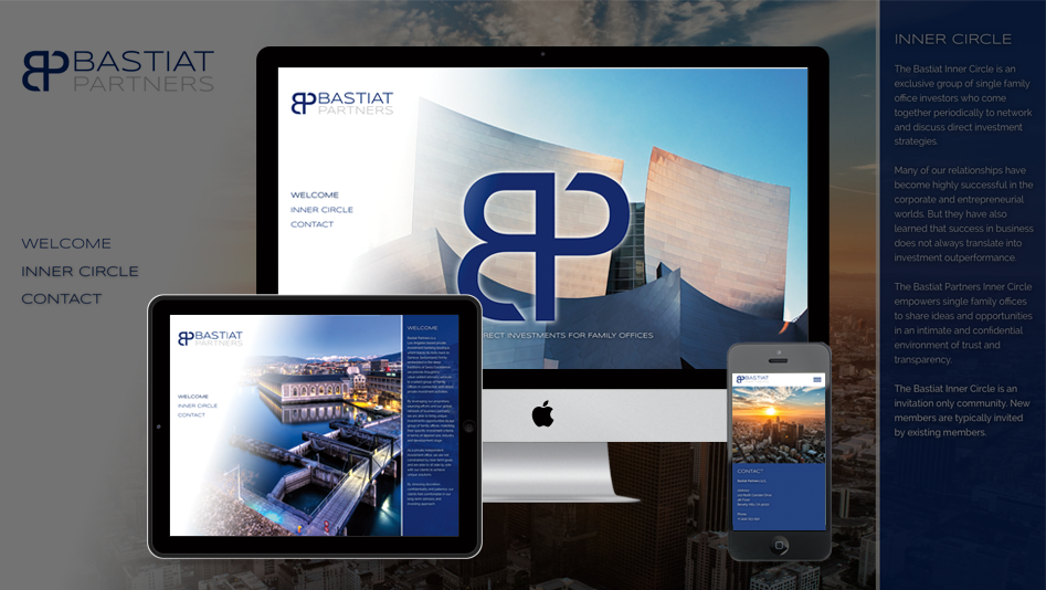
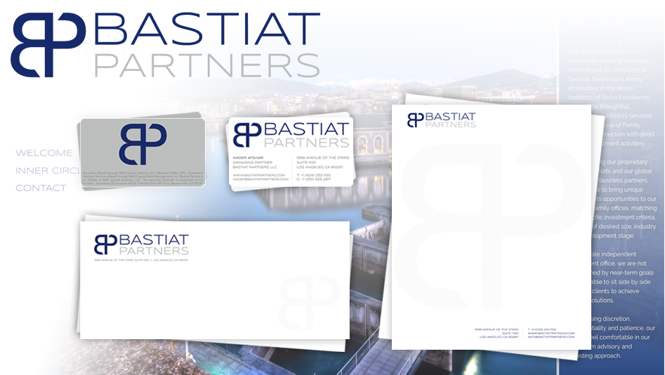
For the Brand Identity, styles & colors were created to correlate with wealth and luxury. Without losing a connection with the “B” in the old logo, the new symbol was creatively designed to maintain connection with the letter “B”, while introducing the letter “P” in a unique way, that is geometrically pleasing to the eye.
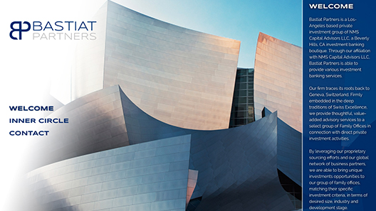
The new website design took an elegant, yet simplistic approach with prominent attention placed on the new brand. Content was kept to a minimum to maintain the essence of exclusivity, and hi-resolution imagery was used to emphasize the firm’s origins. The website was developed using the latest web technology for an “out-the-box” user experience. In addition, the website is fully responsive for a pleasurable browsing experience whether on a large screen, tablet or mobile device.
⟨ Back to Case Studies
Visit Website